Where do people get stuck?
UX Research & Discovery
We watch how people actually use it, find where they hesitate or drop off, and turn that into a clear list of what to fix.

Show us where users hesitate or drop off. We’ll find why, then design flows and screens so obvious that the confusion — and the churn that comes with it — simply goes away.
Why design first
seconds is all a new user gives you before deciding whether to stay.
real users is often all it takes to find where your flow loses people.
clear path through the product, instead of a maze people give up on.
Good design isn’t decoration. It’s the difference between staying and leaving.
Five pieces of work, run in order. Each one removes a reason to leave — until the product feels obvious.
We watch how people actually use it, find where they hesitate or drop off, and turn that into a clear list of what to fix.
We shape the information and the journey — the shortest, most obvious route from “landed” to “done”.
Interfaces that are clean, confident, and on-brand — where every screen quietly tells people what to do next.
Clickable prototypes tested with real people, so we fix the confusing bits before a single line of code is written.
A reusable system and a clean handoff to engineering, so the product stays coherent as it grows.
Researched. Tested. Obvious.
Tech We Use
We stay tool-neutral — we design in whatever fits your team and workflow, and use AI to move faster, never to skip the thinking.
 Figma
Figma
 Sketch
 Framer
 Adobe CC
 Miro
Miro
 Notion
 Webflow
 Storybook
 Canva
Canva
 Blender
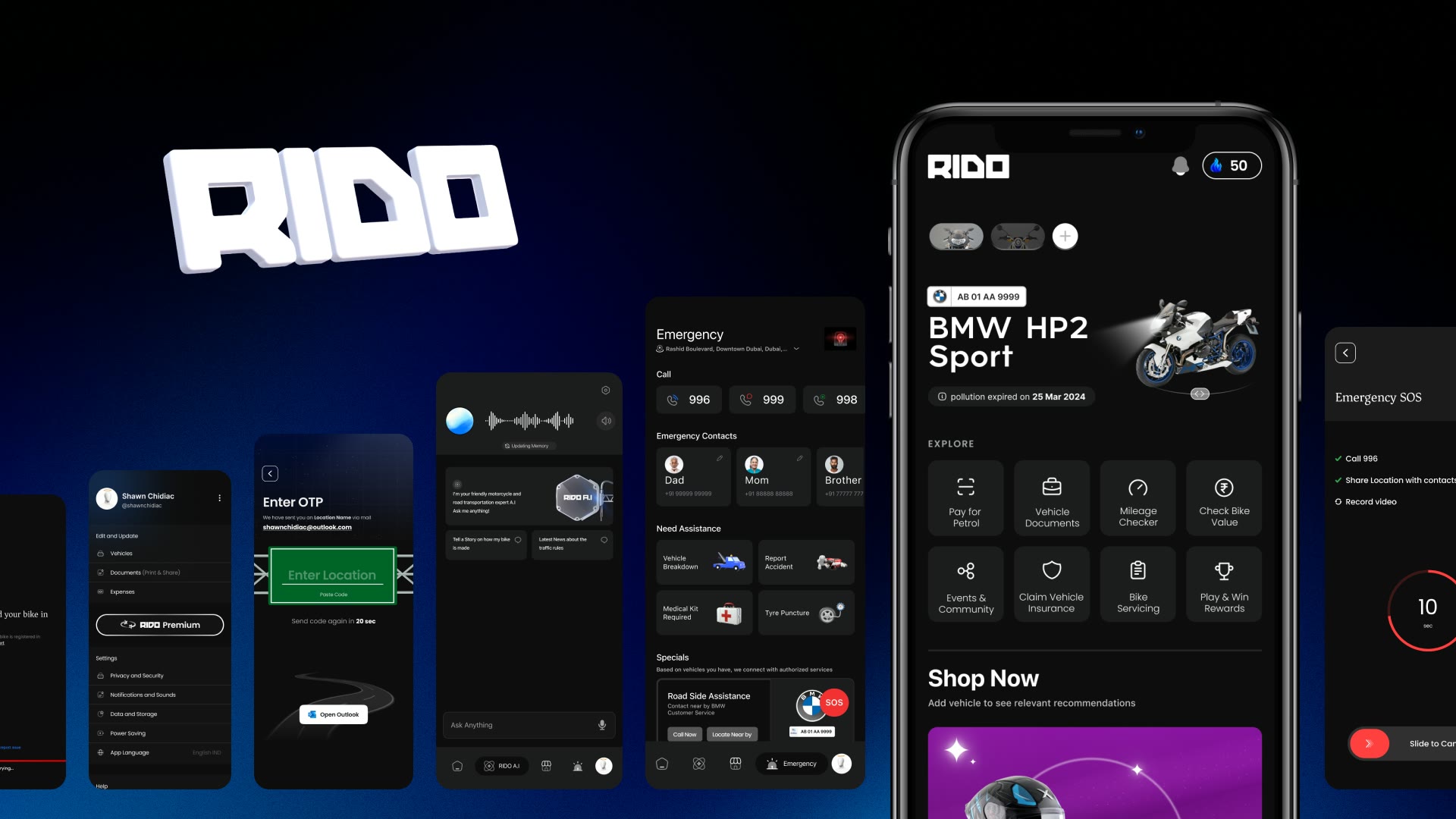
Real work, not a pitch. Users were getting stuck, so we redesigned the path until they weren’t.
RIDO ONE — from a confusing flow to a first redesigned, tested release.
RIDO ONE — daily operational load cut by designing around the real task.
from first call to a clickable prototype the team could test with users.
Representative outcomes from recent engagements.
Thanks to their careful design and detailed thinking, the first ride finally feels obvious. Users stopped dropping off early, and we’ve been able to make smarter product decisions and see measurable growth.
Yes, that is where we start. We run usability sessions and watch session recordings to see where real people hesitate or leave, then turn that into a prioritised list of what to fix first.
It depends on the question. We combine moderated usability tests, quick unmoderated studies, heatmaps, and interviews, and we keep each round small and focused, so you get answers in days rather than months.
Yes. We build clickable prototypes and test them with real users, so the confusing parts get fixed on screen, well before engineering spends time on them.
We design to recognised accessibility standards as a baseline, with proper colour contrast, keyboard support, and clear labels, so the product works for more people and holds up to review.
We hand off a documented design system with tokens, components, and states, and we work with your developers or ours through web & app development, so what ships matches what we designed.
We agree on the numbers up front, such as task completion, drop off, and conversion, and we track them after launch so the impact is visible rather than assumed. Our data & dashboards team can wire this up.
Yes, and if the whole brand needs a lift, our brand & visual identity team can give it a confident, consistent system that carries across every screen.
A short discovery is usually enough to find the biggest wins. Tell us where users struggle and we will shape the next practical step.
Tell us where users hesitate or drop off. We’ll design the clearest path through, so people stay and convert.

 Case Studies