What do we stand for?
Brand Discovery & Positioning
We get clear on who you’re for and what makes you different — the foundation every visual choice hangs on.

Tell us what you want to stand for. We’ll shape a visual identity that makes your product look like it belongs — a real system, not a lonely logo — so people trust it before they’ve read a word.
Why identity matters
coherent system, instead of a logo surrounded by mismatched everything.
is roughly how long it takes someone to form a first impression.
guesswork for your team — clear rules so everything stays on-brand.
A logo is the easy part. Looking consistently credible is the whole game.
Five pieces of work, run in order. Each one makes your product look more like it belongs — until it’s unmistakably yours.
We get clear on who you’re for and what makes you different — the foundation every visual choice hangs on.
A logo and core identity that feel confident and distinct — and work as well at 16 pixels as on a billboard.
Colour, type, and layout rules that make everything you produce look like it came from the same, credible place.
The real-world pieces — site, deck, social, product UI touches — designed so the brand shows up sharp everywhere.
Clear, usable guidelines so your team keeps everything on-brand long after we hand it over.
Distinct. Consistent. Unmistakably yours.
Tech We Use
We stay tool-neutral — we design in whatever fits your team, and use AI to explore directions faster, never to skip the craft.
 Figma
Figma
 Adobe CC
 Sketch
 Framer
 Webflow
 Blender
 Canva
Canva
 Penpot
 Dribbble
 Behance
Real work, not a pitch. These young products went from unsure to unmistakable.
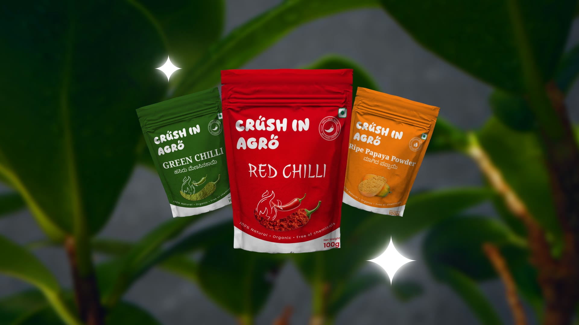
A market-researched brand built from the ground up for a new agri range — logo, tagline and a full design system, applied to packaging for three flagship products that hold their own on shelf as one clear family.
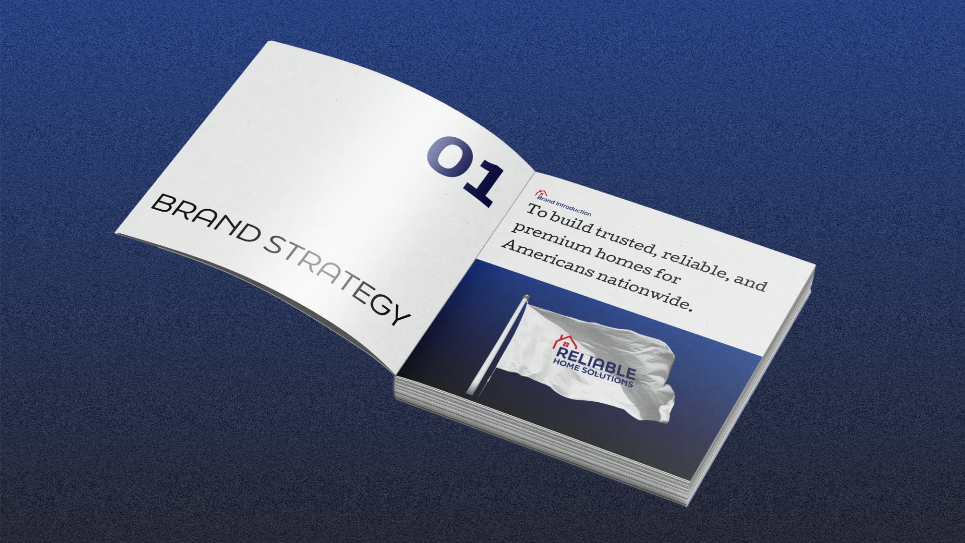
A brand identity built from scratch for a US modular home builder — a logo drawing on the classic American home, plus comprehensive guidelines engineered to scale cleanly across new markets, teams and vendors.
Crush In Agro — from unsure look to a confident, consistent identity.
Reliable Home Solutions — a coherent system that made a complex tool feel trustworthy.
from first call to a visual system and guidelines the team could run with.
Representative outcomes from recent engagements.
As a young agri-brand we needed to look like we belonged. They gave us a confident, consistent identity that reads as credible from the first glance. Buyers take us seriously now — it changed how we’re seen.
Our brand felt scattered. Externo built one cohesive visual system that made us look established and easy to trust. Everything from the van to the invoice finally feels like one company, and clients notice.
You get a system, not a single logo. That means colour, type, spacing, imagery, and usage rules, so everything you make looks like it belongs together.
A practical guide covering logo use, colour values, type scale, spacing, and clear rules for what to do and what to avoid, written so your team or any freelancer can apply it without guessing.
It depends on what is working. We can evolve a brand that still has equity, or start fresh when it holds you back, and we will be honest about which one you need.
Yes. We design for web, product, social, and print, and we test the identity at small and large sizes, so it stays clear from a tiny icon to a billboard.
We choose colour pairings that meet contrast standards, so text stays readable and the brand works for more people rather than only looking good in a deck.
Yes. Our product & UX design and web & app development teams carry the identity into real screens, so the brand and the interface match.
You get organised files that are ready to use, including logos in the right formats, colour and type values, and templates, so your team can move without waiting on us.
A short brand chat tells us what you want to stand for. Book a brand chat and we will shape a confident, consistent identity.
Tell us what you want to stand for. We’ll shape an identity that reads as credible from the first glance.

 Case Studies