Packaging design for an organic agri-products brand entering the market — a shelf-ready system carried across a family of bilingual spice and powder pouches and a retail paper bag, taken from research to production-ready artwork.
Services
Packaging DesignBrand IdentityMarket Research
Year
2026
Team
Advika IyerAnirban Bose
Client
Crush In Agro
01
A brand for the shelf
Crush In Agro is an agri-products brand preparing to enter the market with a new range, and we were engaged to build the brand from the ground up and take it all the way to production-ready packaging.
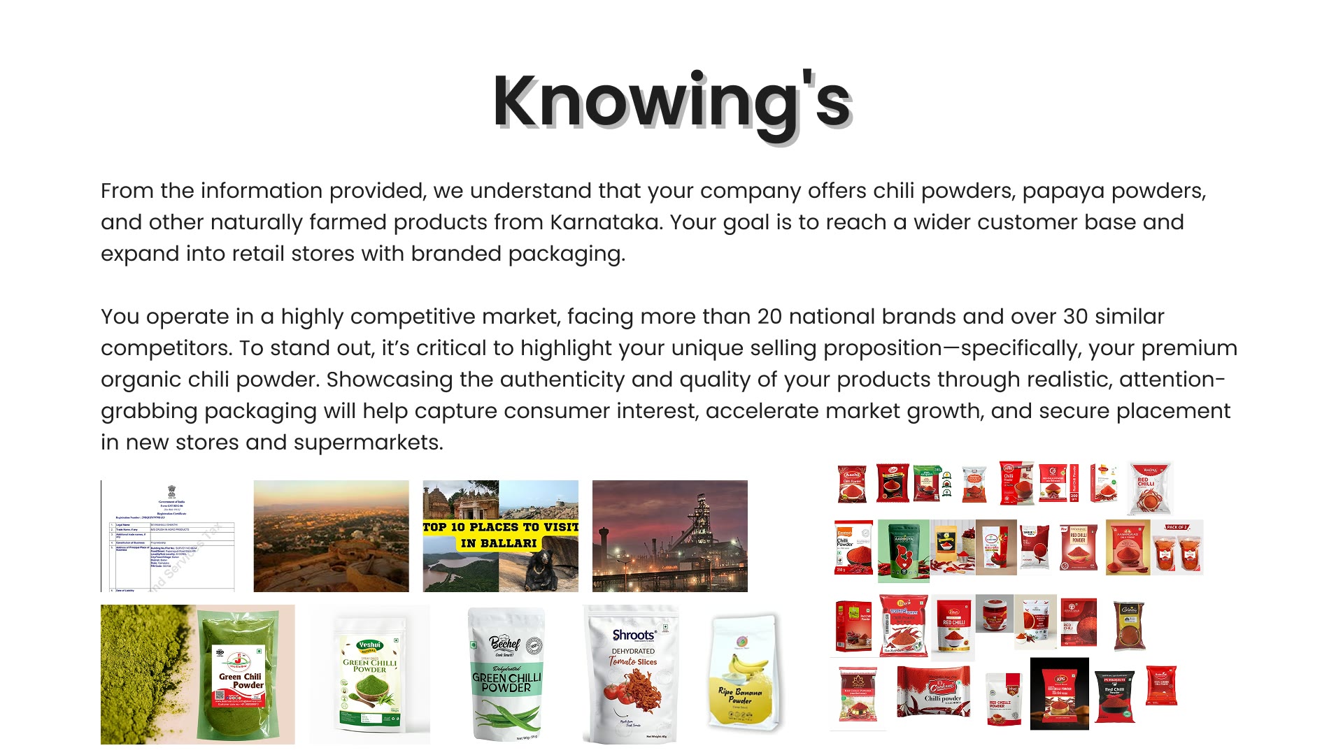
The engagement began with deep market research — studying the category landscape, competing shelf presence, buyer expectations and the visual language that signals quality and trust in this segment — and that research shaped every design decision that followed.
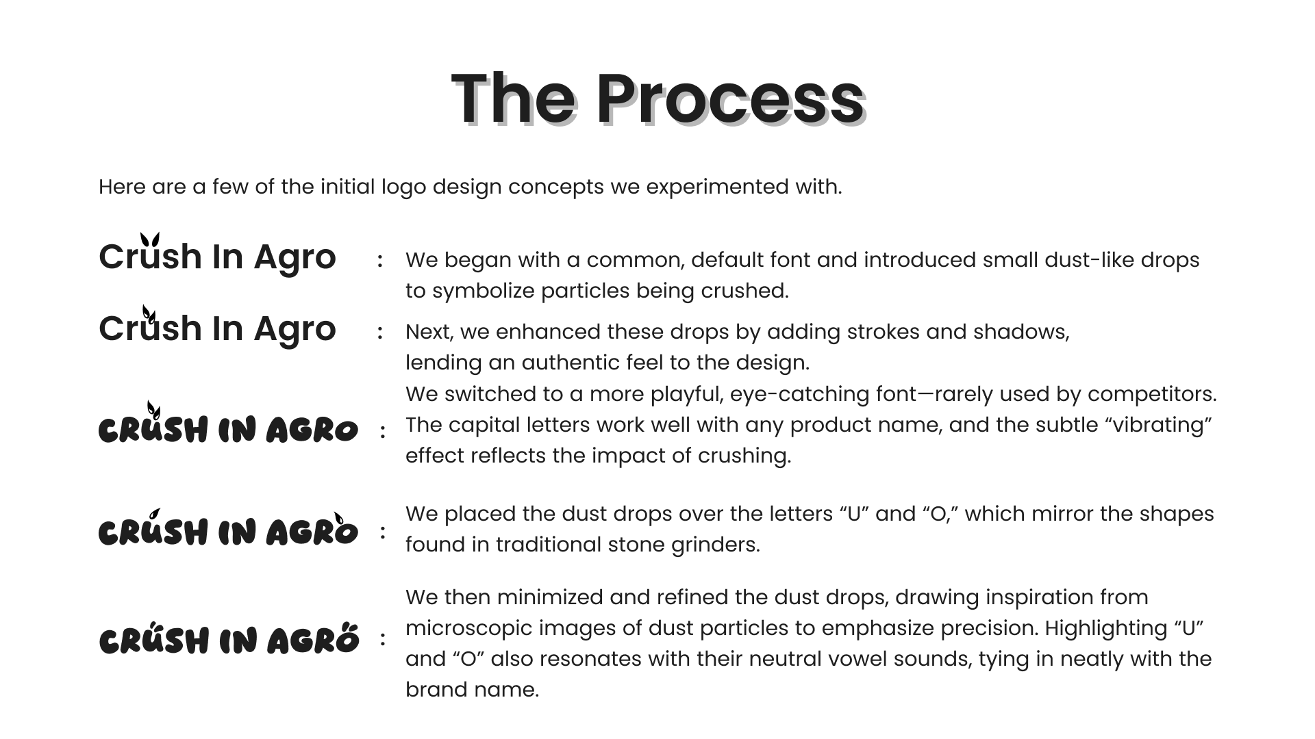
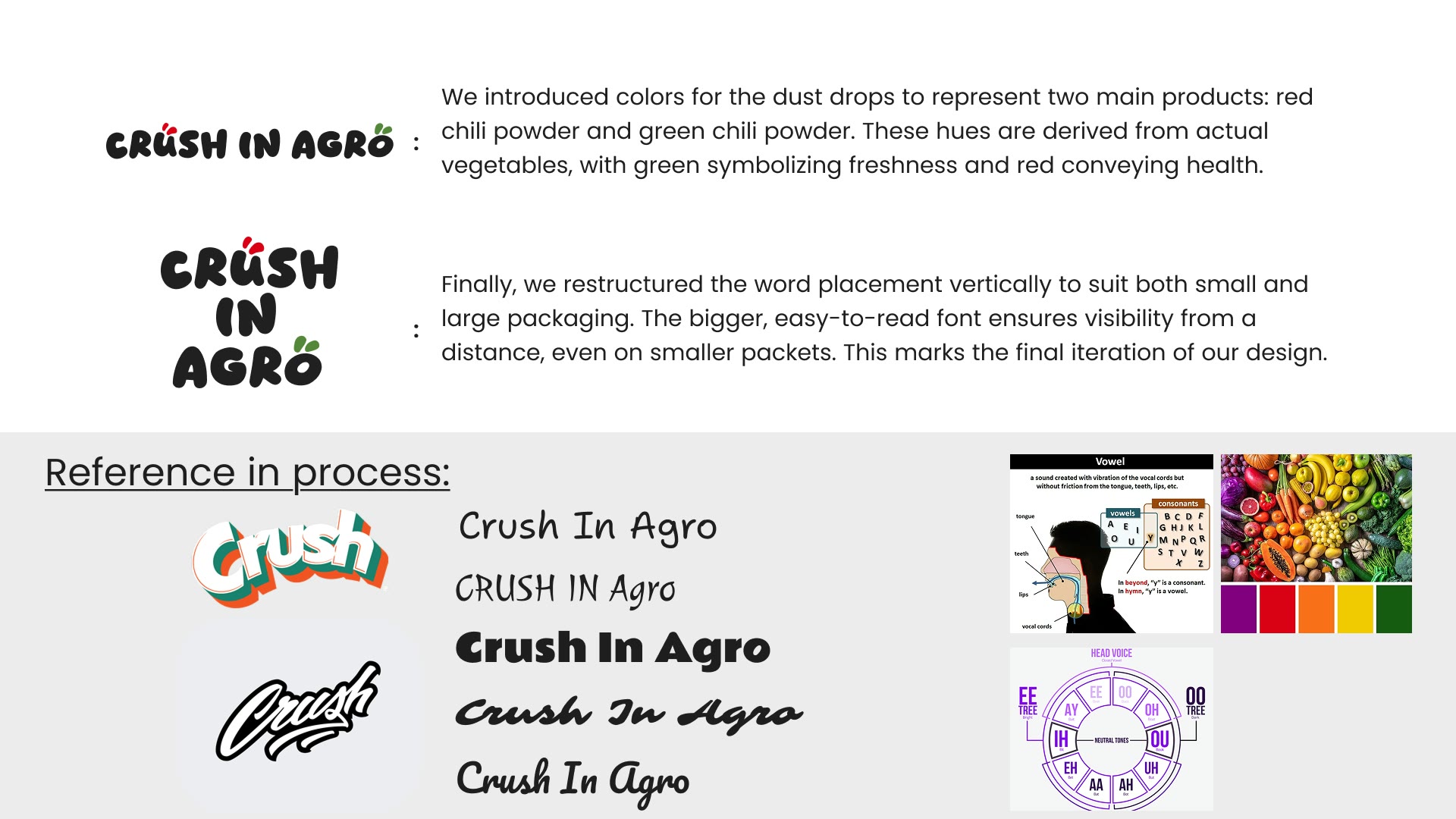
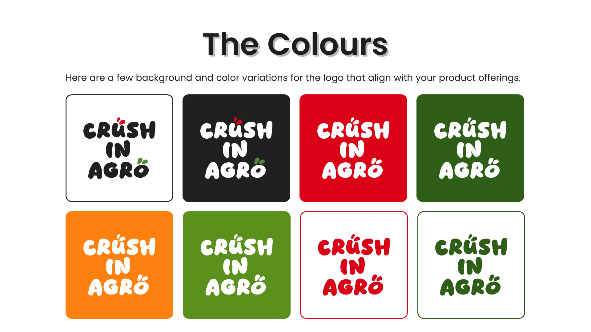
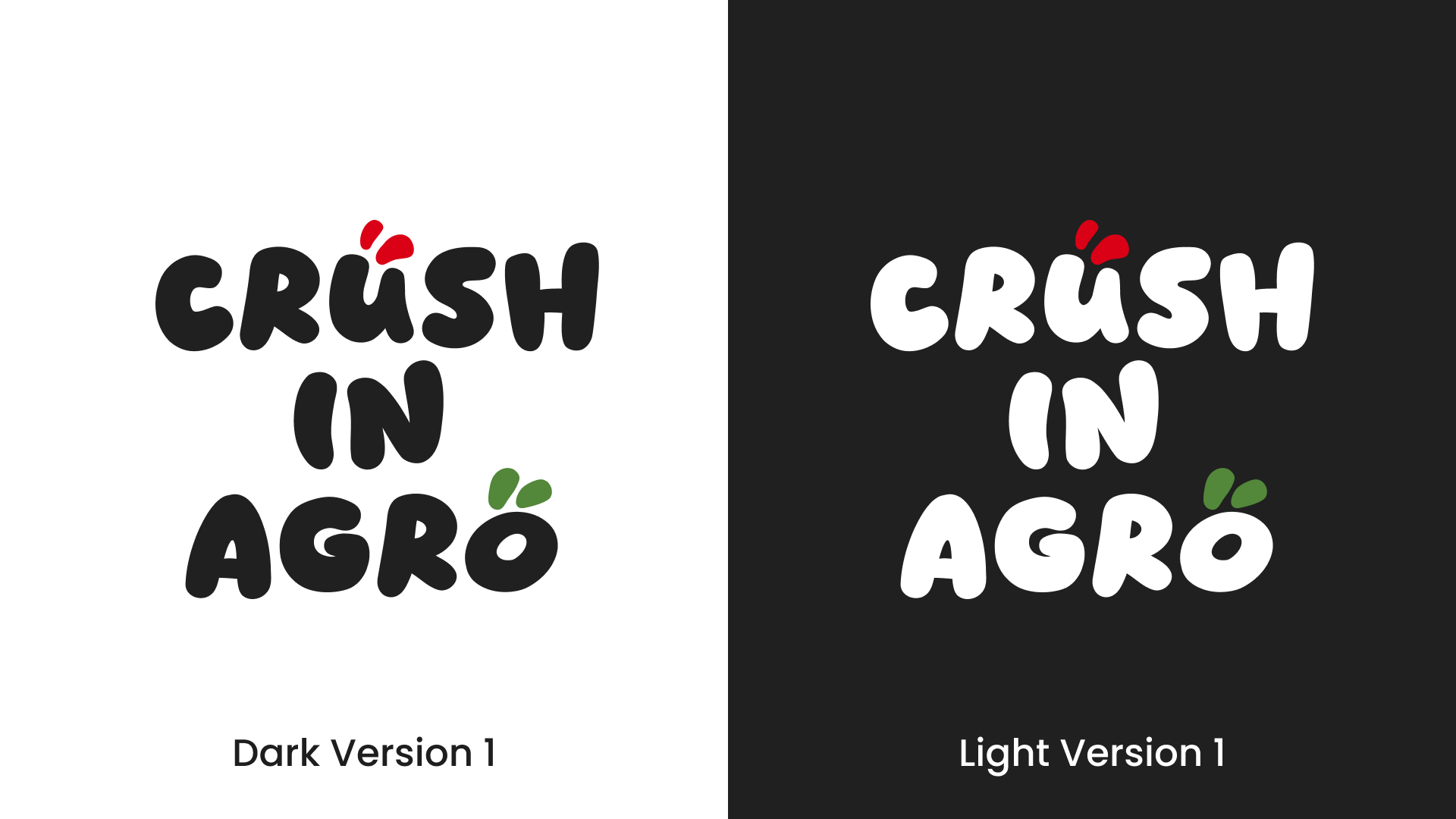
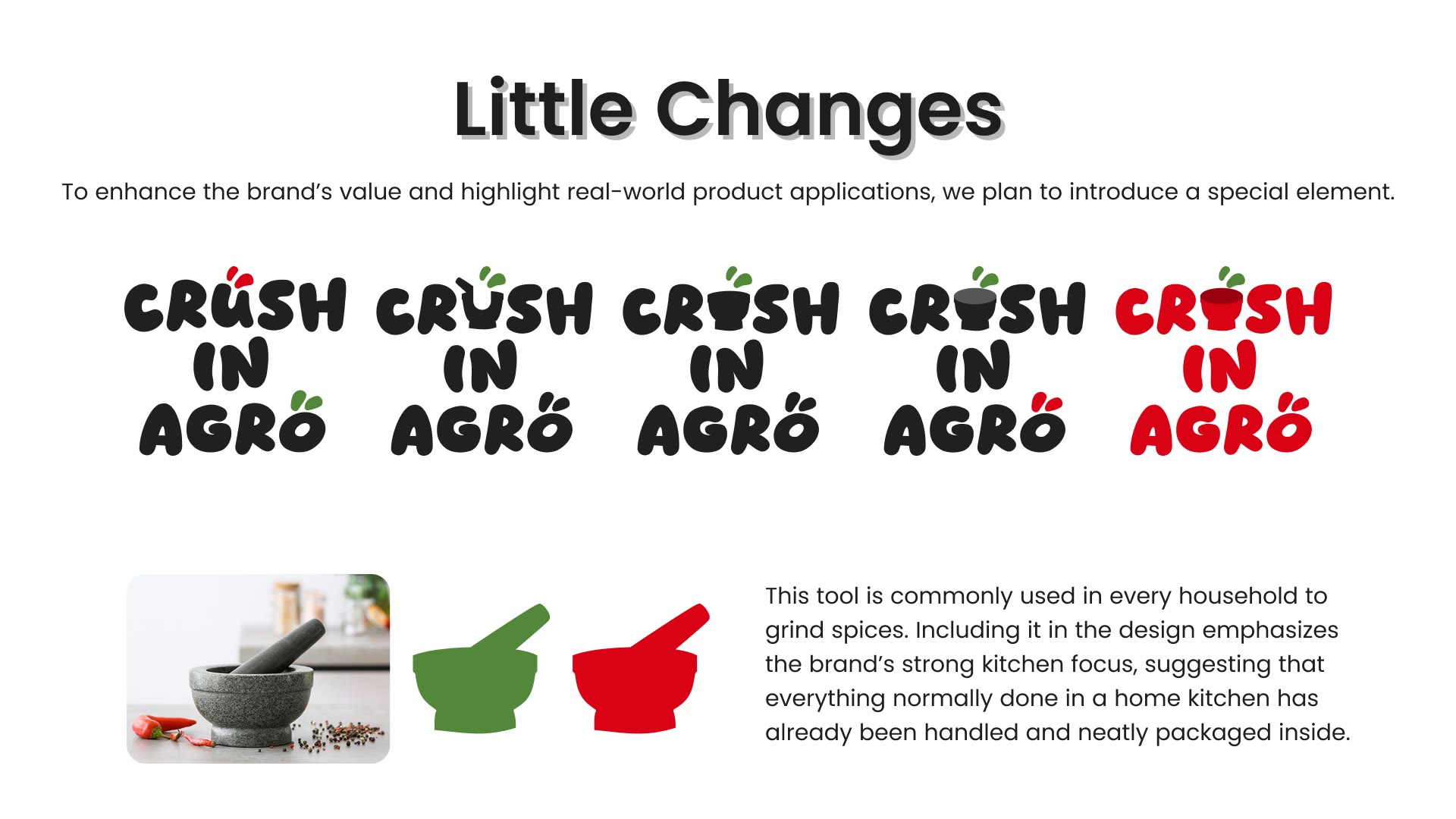
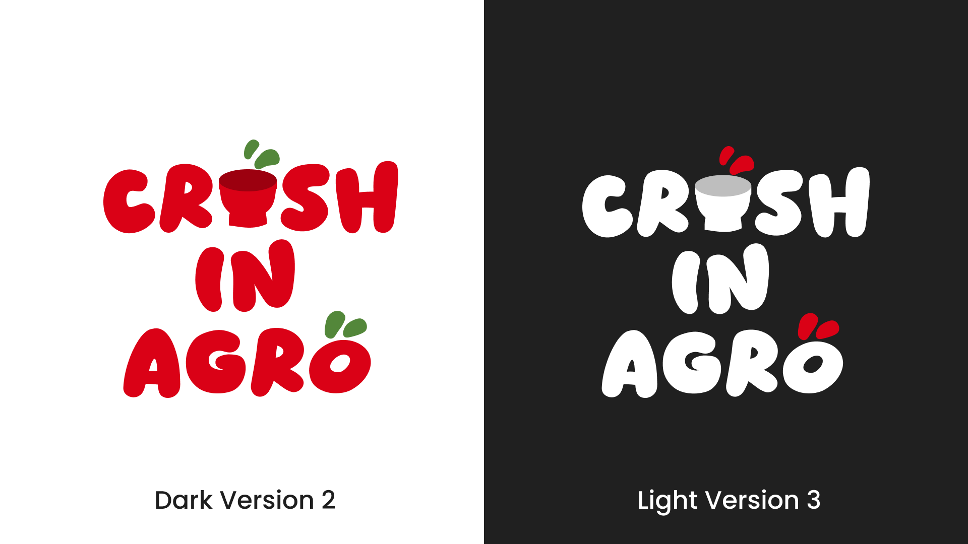
From there we developed the core identity: a logo built to express the company’s grounding in nature and its stated values, refined through rounds of stakeholder review until it secured formal approval, supported by a brand tagline and a complete design system covering colour, typography, imagery treatment and usage rules.
01/15
A brand that enters the market with an identity that is coherent, launch-ready and built to extend cleanly as new products are added to the line.
02
Trust before the first sale
Entering a category is hard precisely because the shelf is already crowded with brands a shopper recognises. A new agri product has seconds to communicate quality and trustworthiness, and no track record to lean on while it does.
In this segment, that trust is carried almost entirely by the visual language — the cues that tell a shopper, at a glance, that a product is credible and worth reaching for. Getting those cues wrong reads as cheap or unfamiliar; getting them right buys a hearing.
So the brief was to establish, before the brand had sold a single unit, an identity that signals quality and belonging on shelf — and to carry it cleanly across a range so the products read as one confident family.
03
Research into identity
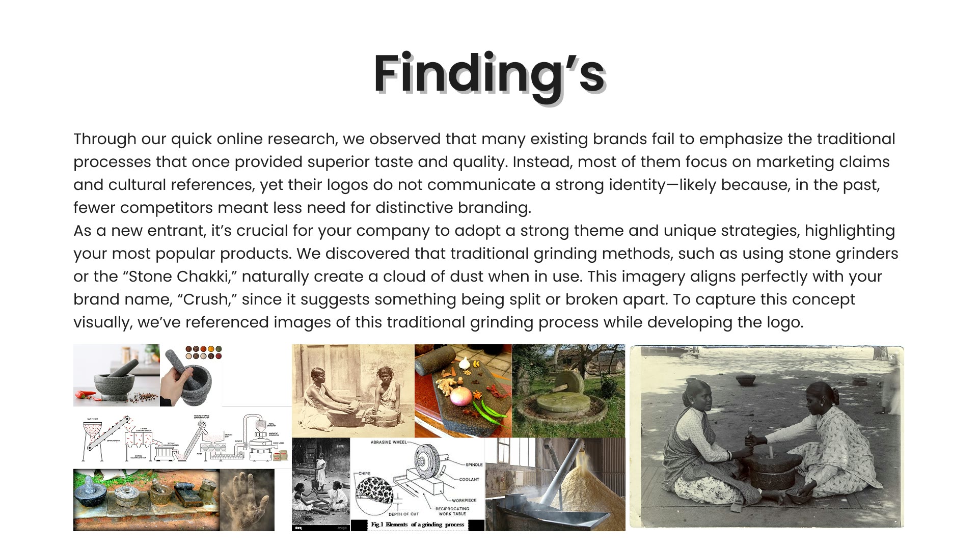
We led with research, studying the category landscape, competing shelf presence, buyer expectations and the visual language that signals quality and trust — and let those findings shape every decision that followed. From there we developed the logo to express the company’s grounding in nature and its values, refining it through stakeholder review until it secured formal approval.
Around the mark we built a complete design system — colour, typography, imagery treatment and usage rules — and a supporting tagline, so the brand had a coherent language ready to apply consistently across everything it would need.
A few principles kept the work honest:
Deep market and category research first
Competitor shelf presence and buyer expectations studied
A logo expressing the brand's grounding in nature
Refined through stakeholder review to formal approval
A tagline and complete design system built around it
Colour, typography, imagery and usage rules documented
04
One family on shelf
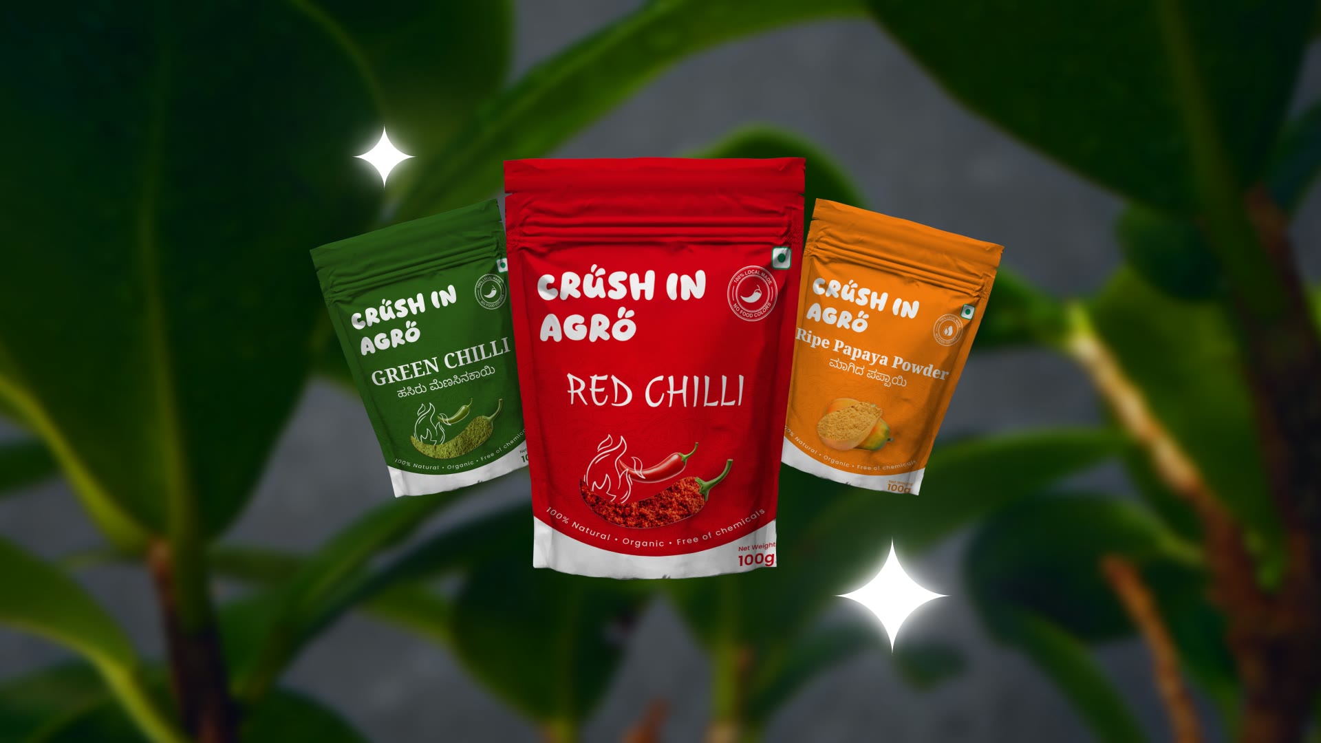
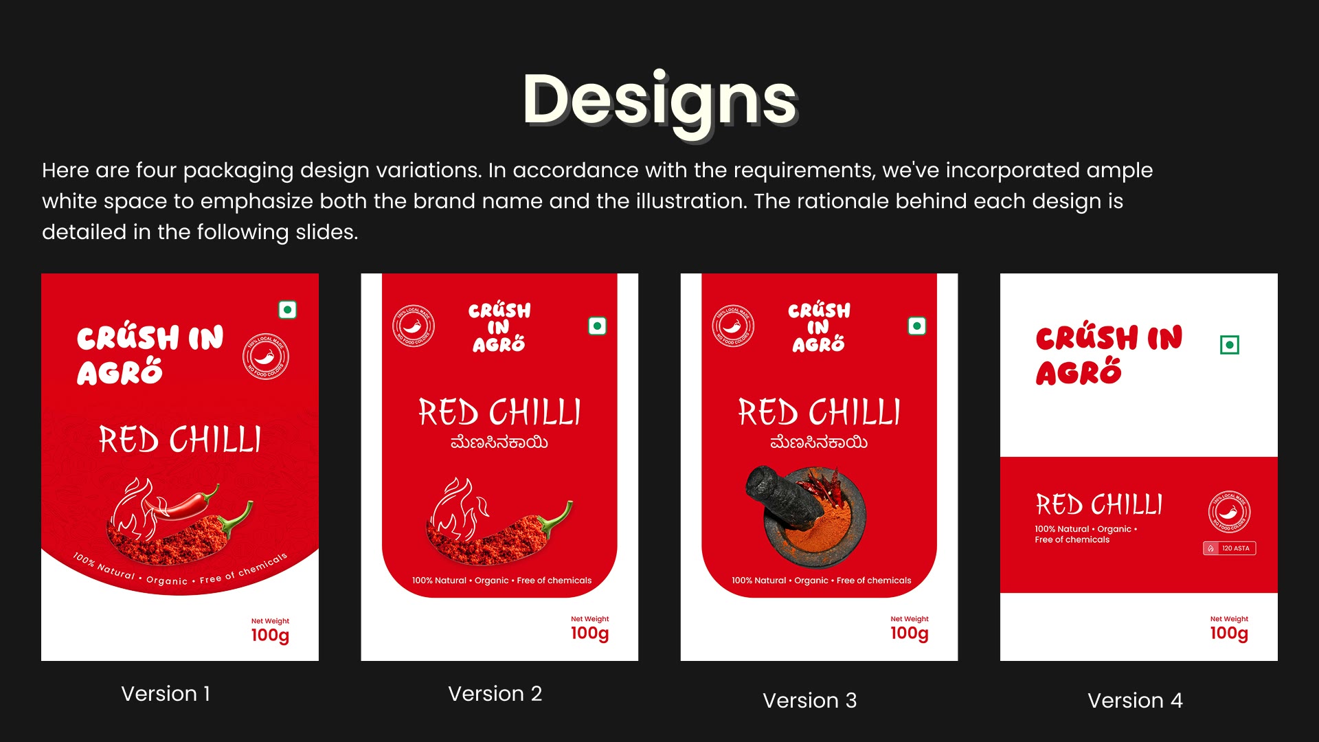
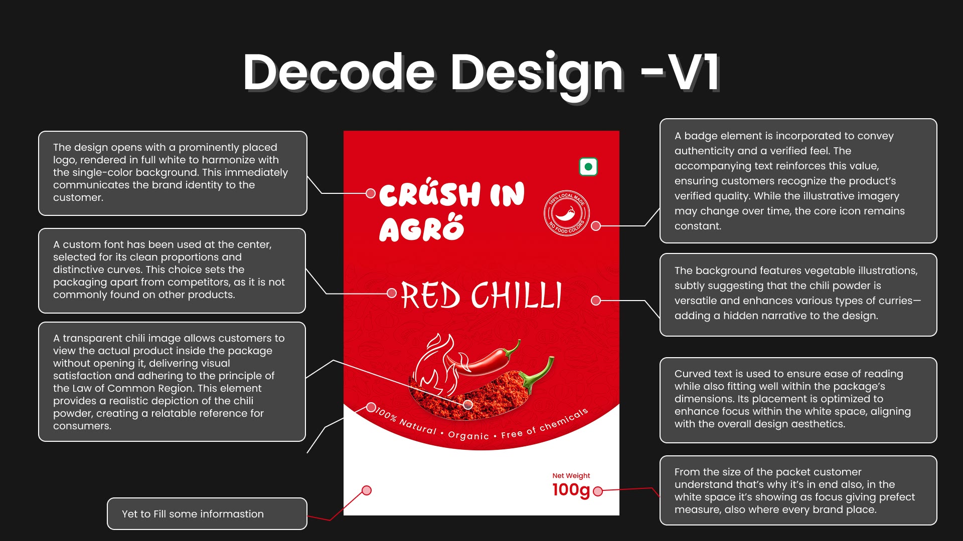
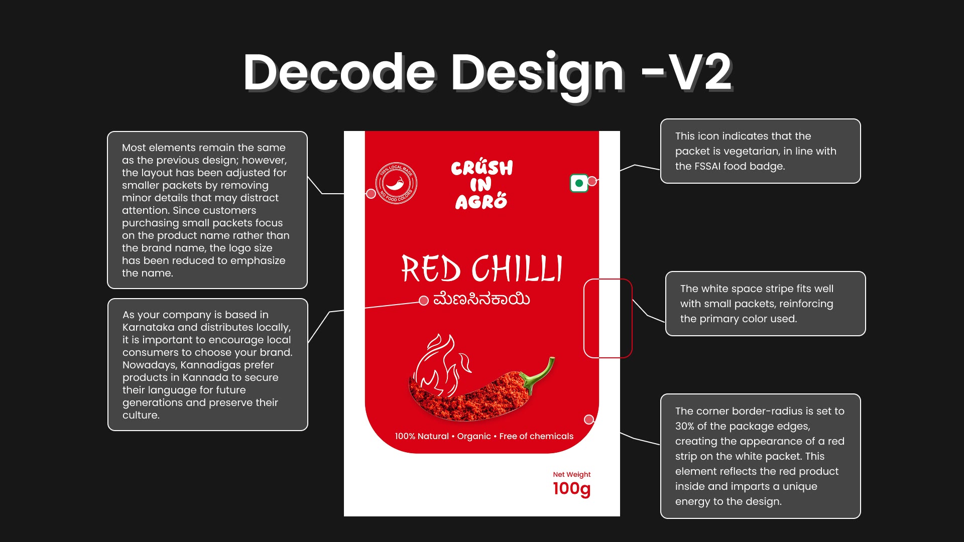
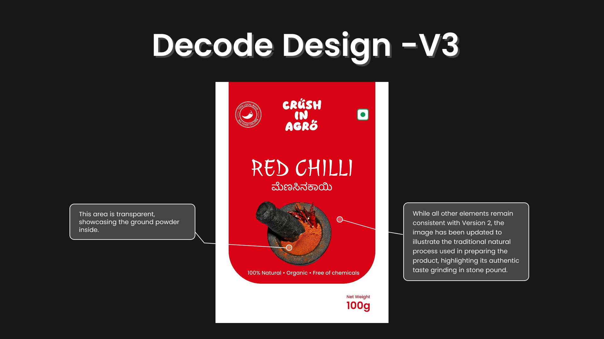
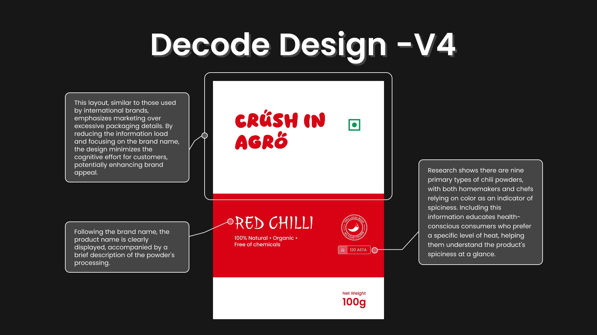
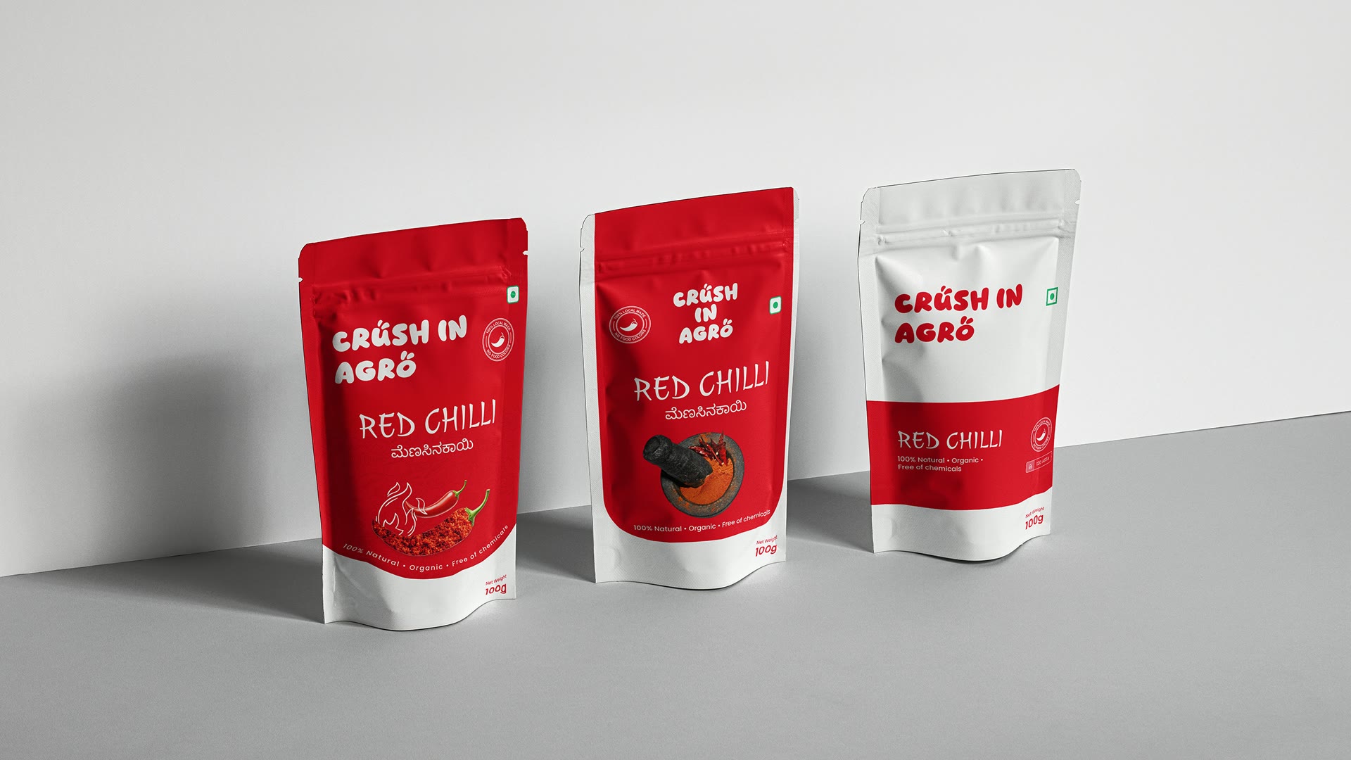
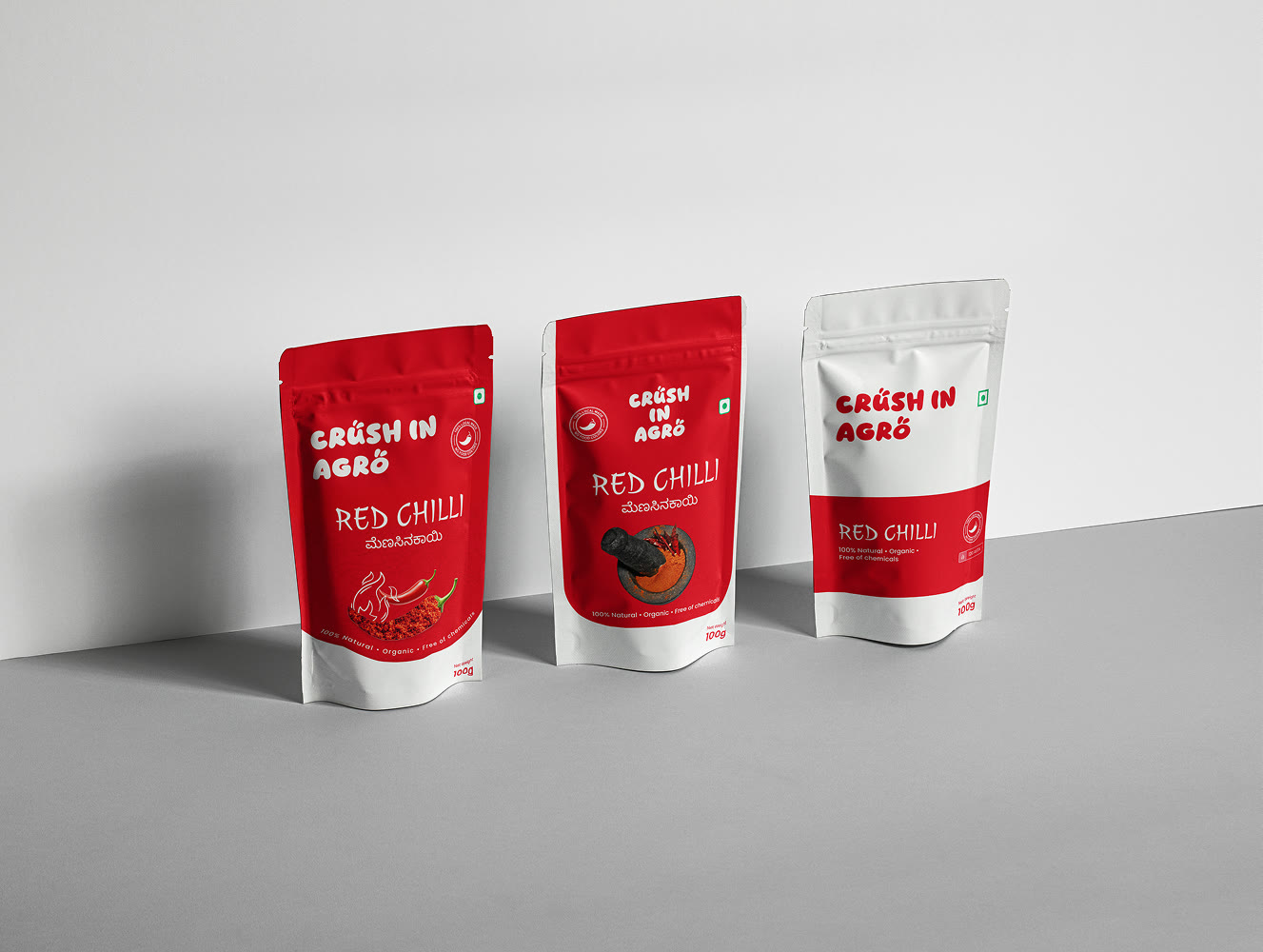
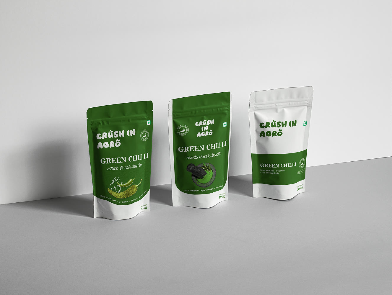
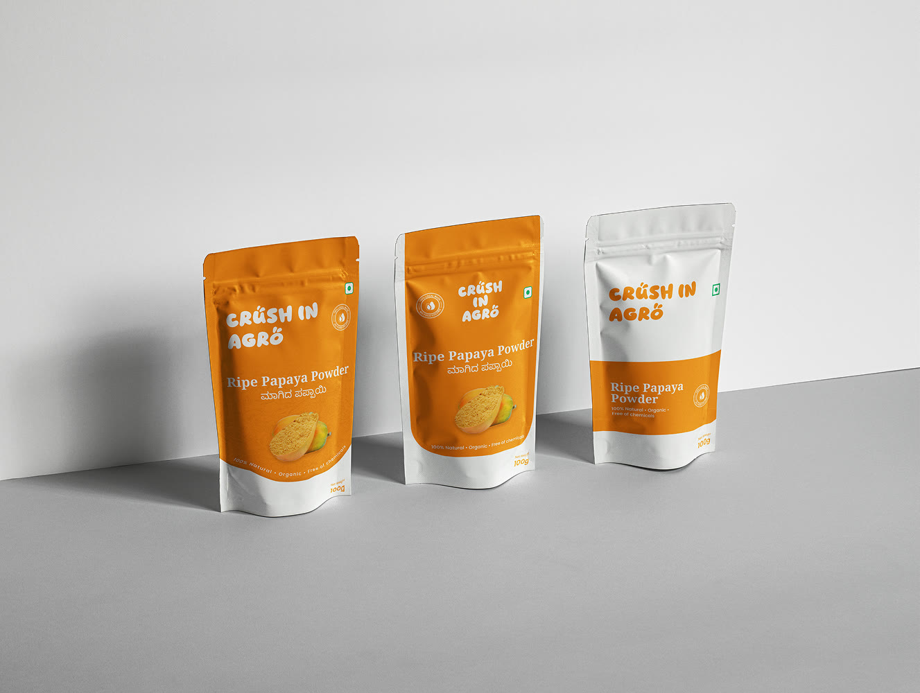
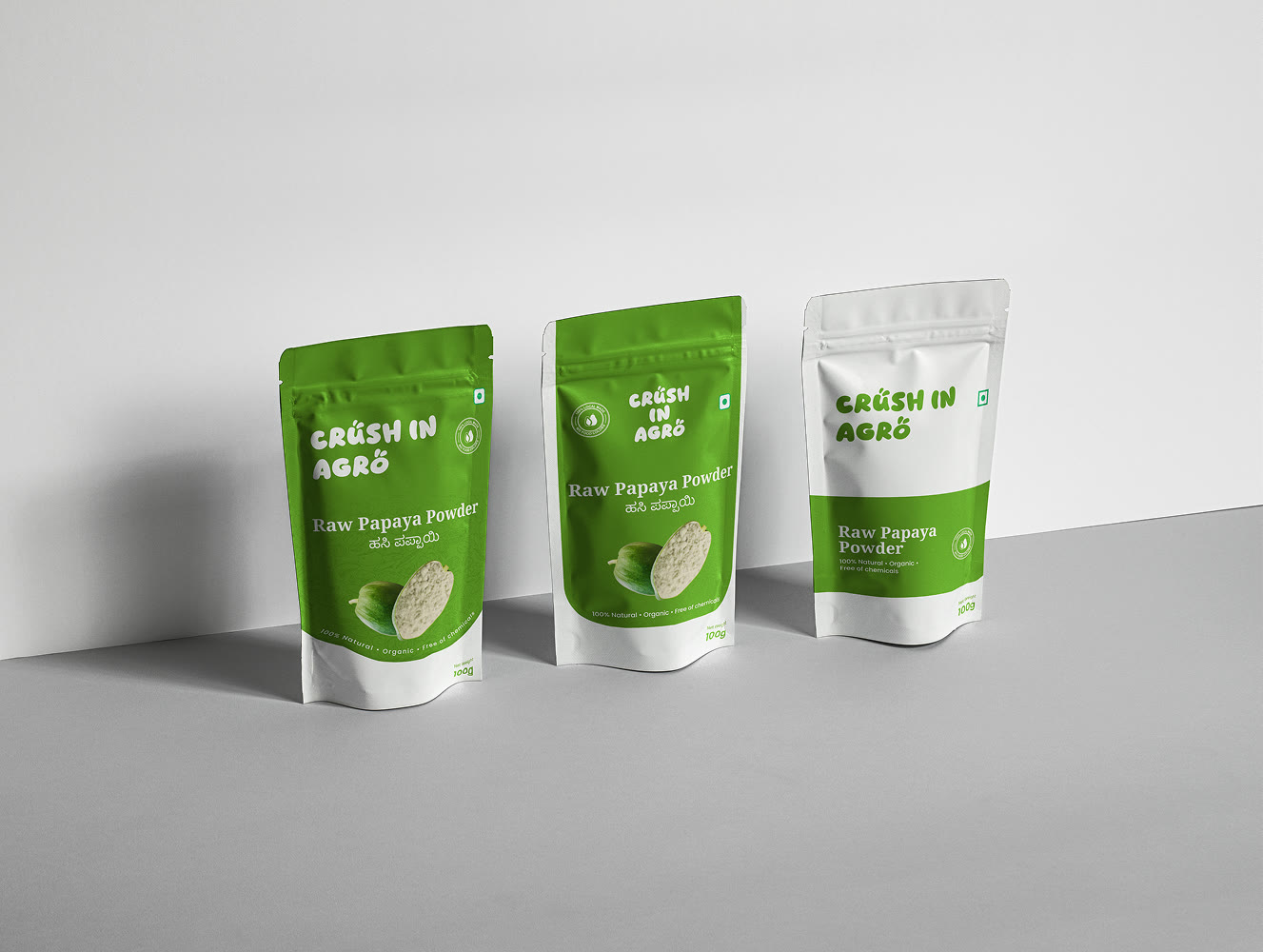
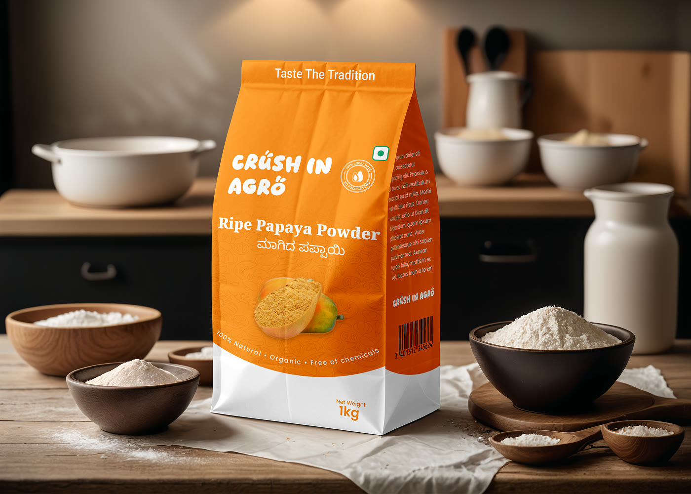
That system was then applied to the packaging itself — a family of stand-up pouches spanning the range, from Red and Green Chilli to Ripe and Raw Papaya Powder, alongside a 1kg retail paper bag. Each pack is colour-coded to its product and set in English and Kannada, with the same ‘100% Natural, Organic, Free of chemicals’ cues, so it holds its own on shelf while remaining unmistakably part of one family.
The packaging is currently moving through the print and approval stage, so the brand enters the market with a range that is coherent and genuinely production-ready rather than conceptual.
What we delivered, research to print:
A brand built from the ground up on market research
A logo grounded in nature and the company's values
A tagline and complete, documented design system
A family of stand-up pouches plus a 1kg retail paper bag
Bilingual, colour-coded packs, each distinct yet one family
Production-ready artwork moving through print approval
05
What the brand changed
Crush In Agro now enters the market with an identity that looks established rather than new. The research-led logo, system and packaging give the range the visual credibility that this segment demands before a shopper will trust it.
The brand is launch-ready and built to last:
A coherent, launch-ready identity built from scratch
Visual language that signals quality and trust on shelf
A full product range presented as one confident family
A design system ready to apply consistently
Production-ready packaging in print and approval
A brand built to extend as the line grows
06
Launch-ready and extendable
Crush In Agro shows the value of starting with research rather than a logo. Because the identity was shaped by what the category rewards, it earns trust on shelf from the first impression.
The complete design system and the family treatment across every pack mean the range reads as coherent and established, not tentative and new.
And because the system was built to extend, the brand enters the market ready to grow — new products can join the line cleanly, carrying the same confident, trustworthy language from day one.
The result in motion
See the brand in motion
The finished packaging across the launch range — Red Chilli, Green Chilli and both papaya powders — closing on the Crush In Agro mark and its ‘Taste The Tradition’ line.
Testimonials
Don't take our word for it - take theirs
We were entering a shelf where trust is everything and we had no brand at all. Externo started with the research, shaped a logo that expresses what we stand for, and built a whole system around it — then applied it to packaging across our whole range so it reads as one family. We're going to market looking established, not new.
We built Crush In Agro's brand and packaging from research to print-ready. If you're launching a new range, we can help you ship it just as well - honestly, and measured.



 The result in motion