
Trust is the quietest thing an interface can earn, and the fastest thing it can lose. People do not decide to trust a product in a single moment. They decide it slowly, across hundreds of small interactions where the screen either did what they expected or it quietly did not.
A trustworthy interface is not about polish or personality. It grows from three plain habits practised on every screen: clarity, honesty, and predictability. Get those right and the product feels calm and dependable. Get them wrong and no amount of visual craft will cover for it. The same restraint we wrote about in why minimalist interfaces never go out of style is where trust starts, because a screen you can understand is a screen you can believe.
Clarity is the first promise
People trust what they understand. When someone opens a screen and immediately knows where they are, what it does, and what will happen if they act, they relax into it. When they have to guess, they brace. Every label, every button, and every empty state is a chance to remove one small question from the user's mind, or to add one. The fewer questions your interface raises, the more room a person has to focus on the task they came to do.
Clarity means plain language over clever language. Call the button Delete account if it deletes the account. Explain what a feature does before you give it a proprietary name. Show the real state of things, not a hopeful version of it. A person who always knows what is going on will forgive the occasional rough edge, because they never once felt misled.
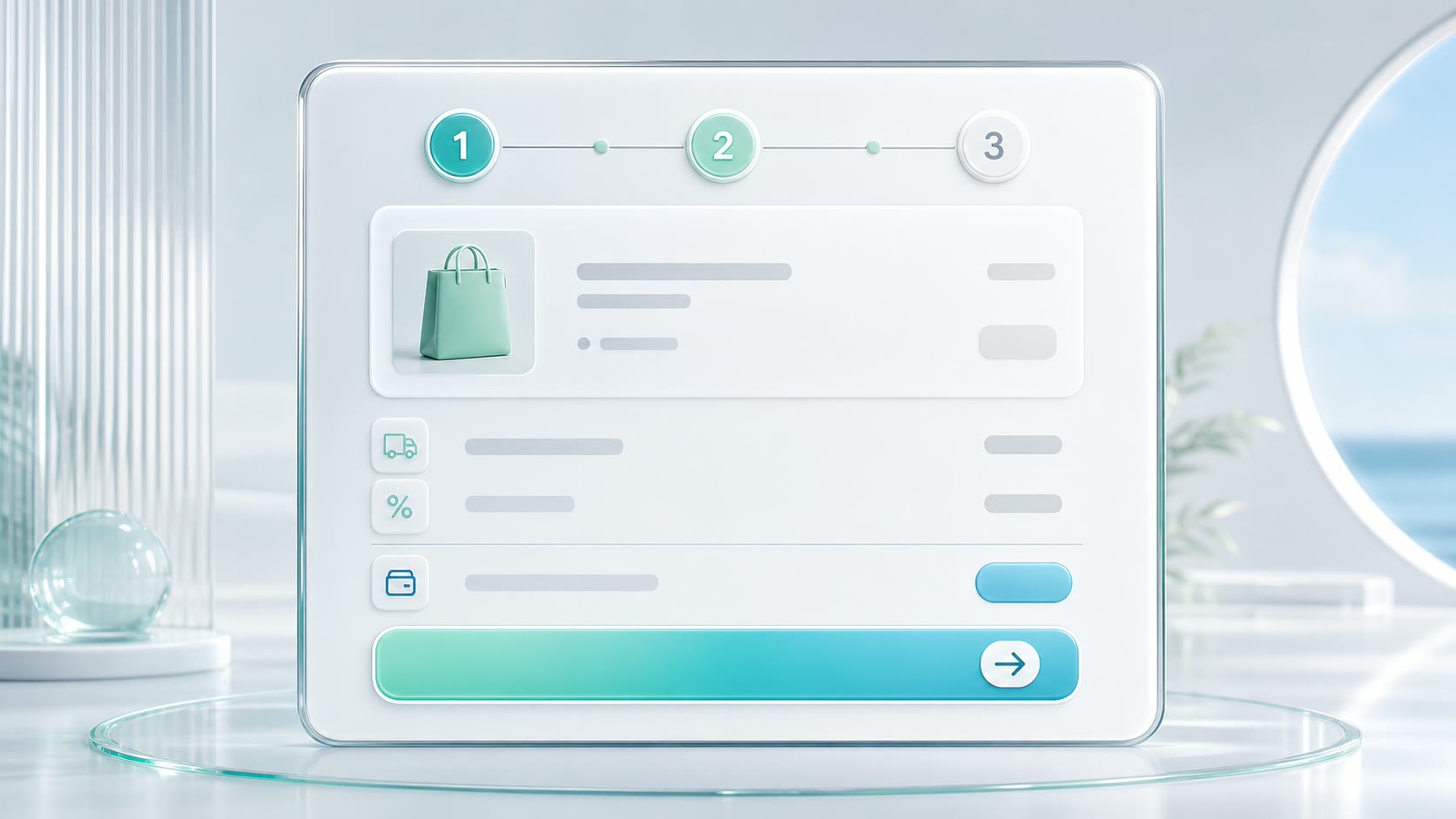
Show status, so nothing feels hidden
One of the oldest rules in interface design is also one of the most ignored: always show system status. If something is loading, say so. If a task will take thirty seconds, show honest progress instead of a spinner that could mean anything or nothing at all. If a change was saved, confirm it. Silence makes people anxious, and anxious people stop trusting the screen in front of them.
Honest status is not the same as constant noise. It means the interface answers the questions a user is quietly asking. Did that send? Is it still working? Did my edit actually stick? A small Saved label, a real progress bar, a gentle Sending state on a button. These cost almost nothing to build, and each one quietly tells the user that the product is being straight with them. The goal is simple: never leave someone wondering whether the thing they just did actually worked.


Trust is not a feature you add at the end. It is the sum of every moment the interface chose to tell the user the truth.
Externo
Never trick the person using your product
The fastest way to destroy trust is to win a single interaction at the user's expense. A pre-ticked box that signs them up for email. A cancel flow buried three screens deep. A cheap grey Decline sitting next to a bright, friendly Accept. These dark patterns work exactly once. Then the user notices the trick, and every future interaction is read with suspicion.
Defaults carry more weight than almost anything else on the screen, because most people never change them. So choose defaults that protect the person, not ones that quietly benefit you. Opt people out of data sharing rather than in. Default to the safer, reversible choice. When the easy path and the honest path are the same path, trust mostly takes care of itself.
A few habits keep an interface honest as it grows:
- Make the safe, common choice the default, and the risky one deliberate.
- Confirm destructive actions, and offer an undo wherever you possibly can.
- Write copy in plain words the user already knows.
- Keep patterns consistent, so a thing learned once works everywhere.
- Never hide the cost, the catch, or the way out.

Predictability, and errors that help instead of blame
Predictability is what lets people move fast. When a button behaves the same way on every screen, and the same gesture always does the same thing, users stop reading and start flowing. Consistency means a behaviour learned once transfers everywhere, and that transfer feels like growing competence. Surprises are delightful in games and expensive in tools.
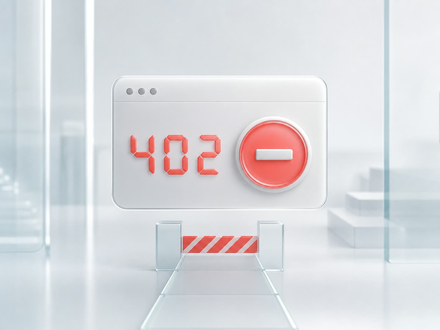
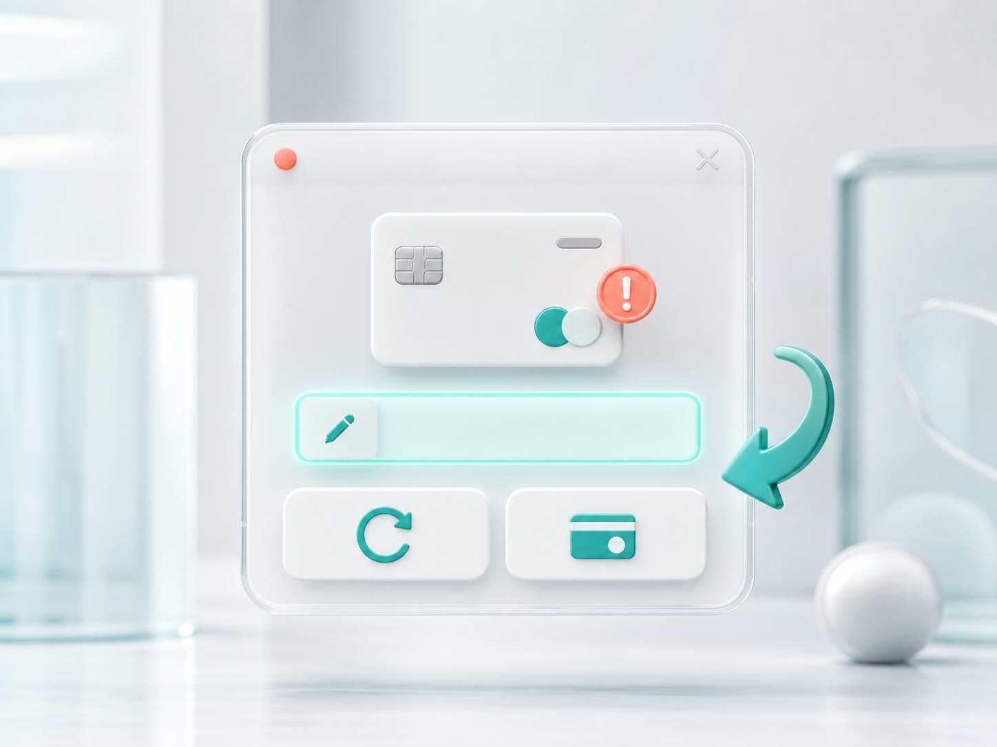
Errors are the real test. Something will eventually go wrong, and how the interface handles that moment decides a great deal. A good error message never blames the user. It says what happened, why, and what to do next, in plain words. That card was declined, try another or check the number beats a bare Error 402. Pair the message with an easy path back, and a failure becomes a small bump instead of a reason to leave for good. Treat every error as a moment where you either keep a user's confidence or quietly spend it.
None of this shows up in a single screenshot, which is why it is so easy to skip. Trust compounds. Each honest detail is tiny on its own, but together they decide whether someone renews, recommends you, or quietly drifts away. Products that people trust get the benefit of the doubt when they slip, and the quiet free marketing of being recommended by name. That is the real return on caring about the small things, and it is exactly the standard we hold ourselves to when we design and build products.
So audit your own interface with one blunt question: at every step, does this tell the user the truth? Wherever the answer is no, you have just found your next improvement. Trust is not a screen you design once and forget. It is a promise you keep, one honest interaction at a time. If you would like a second set of eyes on yours, tell us what you are building.
 UX & Trust FAQ