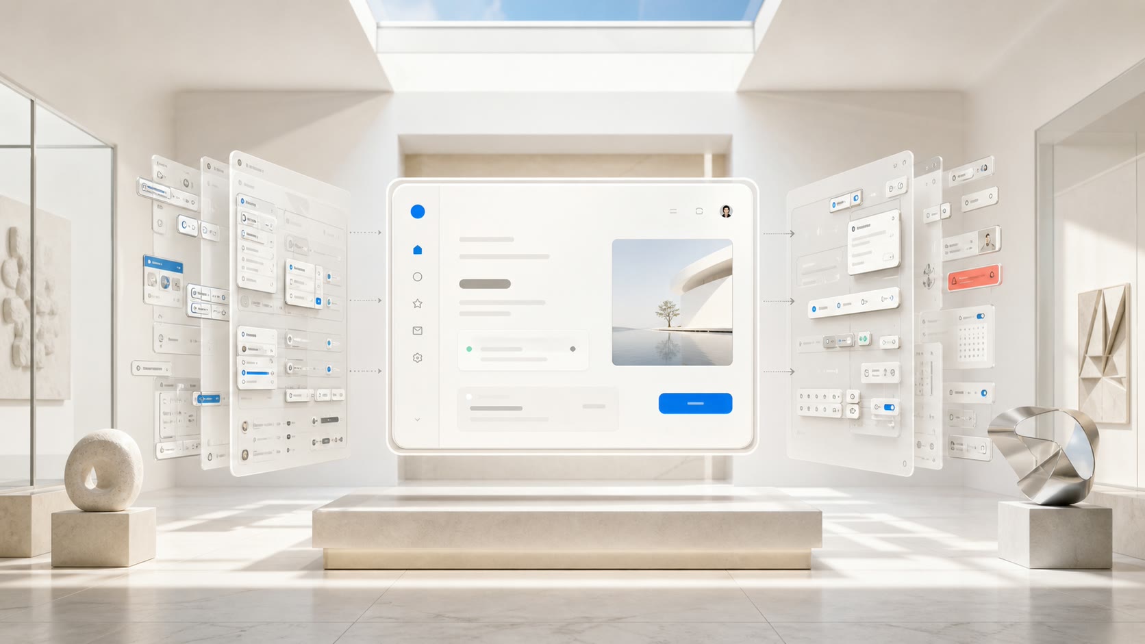
Every product starts clean. Then features ship, edge cases pile up, and the interface quietly fills with buttons nobody asked for. Minimalism is not a coat of paint you add at the end. It is a discipline you practise the whole way through.
The interfaces that still feel good five years from now are rarely the flashy ones. They are the ones that show you only what matters right now, so you always know what to do next. That clarity is the same instinct behind designing interfaces users actually trust, and it is why restraint outlasts every visual trend that comes and goes.
Restraint is about weight, not count
When people hear minimal, they often hear empty. The two are not the same. Restraint is about weight, not count. It is the judgement to decide what earns a place on the screen and what does not.
A single, confident primary action does more work than five hedged ones. Give someone one obvious next step and they take it. Give them five and they stop to rank the options first, and every extra choice is a small tax on their attention. The screen gets slower even though it looks busier.
Think of a checkout that shows one clear Pay button next to one that offers pay now, save for later, apply a code, and split the bill all at once. The second screen is not more capable in the moment. It just hands the buyer the sorting work that the design should have done for them, and every second spent choosing is a second spent not buying.
Every element you remove is one less thing to learn, one less thing to misread, and one less thing to maintain later. Those savings compound. They show up as support tickets you never field and onboarding steps you never have to write.
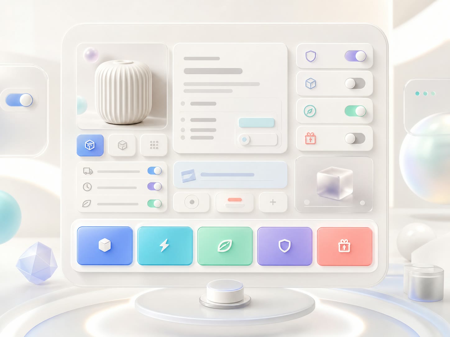

There is a quieter benefit too. When an interface asks for less, people assume it is handling the rest on their behalf, and they relax. When it asks for more, they start to wonder what could go wrong, and they hesitate. Fewer elements is not only easier to use. It reads as more trustworthy.
Good design is as little design as possible. Less, but better, because it concentrates on the essential aspects.
Dieter Rams
Where teams get minimalism wrong
The most common mistake is confusing minimal with empty. A screen with three controls and no signposts is not clean, it is confusing. People cannot tell where they are, what just happened, or what to do next. Stripping out labels, feedback, and structure does not make a product simpler. It turns it into a guessing game.
Real minimalism removes noise, not information. It keeps the message and drops the decoration. The goal is never the fewest possible pixels. It is the shortest honest path to what the user came to do.
Teams also chase minimalism as a look. They ship a beautiful, sparse home screen and then bury the actual work behind three taps and a hidden menu. That is not restraint, it is hiding. If the important thing is hard to find, the interface has only moved complexity around instead of removing it.


The one question that keeps interfaces honest
We run every screen through a single test. If we removed this element, would the user still succeed? If the answer is yes, it goes. If the answer is no, it stays and it earns emphasis. That one question settles most design arguments faster than any style guide.
It works because it forces a decision about outcomes, not taste. Nobody has to win an opinion about whether a panel looks cluttered. You ask whether a real person can still finish the job without it, and the screen answers for you. The same bias toward evidence over preference shapes how our team approaches product and craft on every engagement.
The test also protects you from your own cleverness. The feature you are proud of gets the same scrutiny as the one you inherited. If a slick animation, an extra setting, or a second dashboard does not change whether the task gets done, it is decoration, and decoration is the first thing to go when the screen fills up.
- One primary action per screen. Everything else is clearly secondary.
- Default to the safe, common path, and keep the rare one a single step away.
- Write the copy first, then design around the shortest honest version of it.
- Measure time to first success, not the number of clicks or screens.
- Add a control only when a real user, not a stakeholder, gets stuck without it.
Applied honestly, this pushes complexity to where it belongs. Common tasks stay one step away. Rare and powerful tasks are still there, just tucked behind a clear intent so they never crowd the everyday path.
Minimalism is what lets a product scale
Restraint is usually sold as a matter of taste. Its real payoff is operational. A small, well-chosen set of components means the tenth screen looks like the first, and the hundredth ships without a rewrite.
When every pattern is reused, your team stops reinventing buttons and starts shipping features. New people learn the system once and apply it everywhere. Users learn it once too, so the product feels familiar even in corners they have never visited.
That consistency is what makes software feel dependable long after the launch buzz fades. It is also why minimalism ages so well. A tight system has less surface area to break, less to redesign when fashions shift, and less to explain when someone new joins. If you want that discipline built in from the first sketch, it is the through line in how we approach design and engineering on every build.
So the next time you are tempted to add one more toggle, ask what you could take away instead. The interface that survives that question is the one that still works, still makes sense, and still feels effortless years from now. That is why minimalism never goes out of style. It was never a style to begin with.
 Minimalist UI FAQ